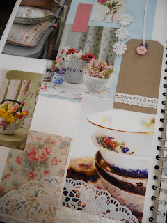
Having a look through my new issue of Country Homes & interiors i found lots of mix and match fabrics that just look beautiful! I just love vintage!
patchwork bed cover.
Mix & match bathroom love the busy black and white tiles against the simple pastel walls.
Outdoor bold bright colours with a clash of busy floral printed cloths
Labels
- About Me (1)
- Buttons Patchwork (8)
- Design Work (27)
- Inspiration (13)
- Visits (3)
- commercial Work (4)
Thursday, 25 August 2011
Our New Postcard/flyer :)
As we have decided to move Buttons Patchwork to Gootrey Home & leisure in Cheshire as the store will be nearer to us. This is our new flyer/postcard for Buttons Patchwork, i just love the bright colours! We wanted to create a flyer with our own drawings mixed with images and funky colours to suit our products!
Front view
back view
Front view
back view
Love Photos
I have always loved going out with my camera and taking lots of pictures of everything i love and things that inspire me. It could be the colour, place or anything i see that i love!
Enjoy!
A lovely sunny day in llandudno for taking a few photos!
that looks nice! Candy cane by the sea side :)
A lovely cute cottage i just love near to where i live, looks just lovely in the white snow.
A trip to the Cotswolds in Gloucestershire gave me lots of inspiration, some cute little shops and lovely old fashioned tea rooms.
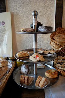
A nice slice of cake in a tearoom
Photography with friends....... :)
Me and some friends decided to head to Turn Hill in Shropshire to have a look round as the sun was going down.
A light painting photograph taken in Leek loved doing this :)
an old abandoned hospital in Chester scary!
a trip to London love the pastel buildings
spotted this pastel floral bed in the front window of designers Guild so different
Love this picture! found it in a little cake shop in London
My old rag doll i found in my bedroom love the little floral dress with her curly hair
Found in interior shop in Chester Love this, looks homemade clash of gingham with busy florals
'Vintage In Bloom'
For my first personal project i wanted to create a collection of old vintage china i had found from antique shops to add my designs onto.
I have taken inspiration from an English country garden with vintage china and intricate lace. Mixed with delicate dancing clusters of flowers on to an old swirled edge. Dappled rose pinks, spring yellows, olive greens and shades of soft blues that glisten with edges of gold.
Chosen designer:
Pip Studio, using bold bright colours mixed with a softer palette brings out the detail and edging on the ceramic ware. Organised repeated clusters of flowers with trimmed edges gives a very ‘kitch’ feel.
Looking at magazines and trends of today, Country Living, Homes And Antiques, Textile View, Salvedge.
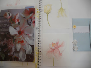
A flick through my sketch book.......
just to start by setting the mood of my project with bits of imagery i have found with all my lovely buttons and lace!

some quick paintings in gauche of some flowers i picked just to get me started.
water colour paintings, really feel like these are working well.....
Doily pattern with masking fluid and gauche really like this technique.
just some more inspiration
Pip Studio were my main inspiration.
I designed a screen to print onto paper to then play around with my water colour paintings, this worked really well as it helped me think about layouts for final design ideas.
Love the gold ink against the soft water colours.
Final Photo Shoots
I wanted to create a photo shoot scene for my final pieces to show was they would look like if purchased in reality. This was so much fun! i really enjoyed this, playing around with the lights, setting the scene with my cream rustic garden table, with some cute cupcakes and soft flowers.
Such a lovely ending for a brilliant project :)
Wednesday, 24 August 2011
Live Brief For Owens & Kim.
At university we got set a live brief for a fashion print company called Owens & Kim based in London. We were asked to produce three final garment shapes from the templates provided based on the layout 1950's scarfs. As soon as i was given my brief i decided to take a trip to Manchester as there are loads of cute vintage shops there full of inspiration.
Manchester was brill and found lots of inspiration to start my drawing at research, i also made an appointment to look at the Betty Smithers Collection at university where i got some shots of vintage scarfs on models. Here are some photographs of my trips and inspiration..... :)
Lots of scarfs! Everywhere!
Loved manchester such a fun yet inspirational trip!
Betty Smither's Collection.....
Mood board i produced from my research so far....
Lenny the lady from Owens & Kim took a visit to the studio to see how we were getting on with our research, she was very helpful and asked inspired me most from the things i had seen so far. I loved the old vintage horses, flowers and butterflies. So she suggested i created an old vintage fair theme to draw from. I decided i wanted it to be in a spring summer 2011 collection so looked at magazines such as 'Look' and 'Vogue' to find some trends that are fresh, girly and colourful!
Bellow is my colour board, i used buttercup yellows, lime greens, candy floss pinks and cherry red. Love creating mood boards adding my buttons and ribbons. I was very inspired by Cath Kidson's colours and Pip Studios 'Kitch' feel. Hope you like it!
I decided to create my Vintage Fairground mood i wanted to take a trip to London to have a look at some little toy shops and anything else i might find! Really enjoyed gathering my research i found a lot of things in London....
cute toy shop in Islington London, old fairground scene :)
Love these old teddies.....
swirly candy cane!
This is my new mood board for my vintage fairground theme filled with inspiration i can draw from.
I then started to do some black and white drawings using different media to then put onto Photoshop. I did small small A4 samples of my layouts for my garments to see if the colours worked well etc. I didn't like the feel it gave to my drawings as i wanted quite a handmade feel about my final designs. So i continued playing around and started to use the heat transfer dyes onto the different polyester fabrics. This worked really well for what effect i was looking for so i kept playing around with layouts and the dyes. Then created my final pieces.
These are just a selection of my final garments.....
Subscribe to:
Comments (Atom)


